

Written By: Rodney Warner
It is estimated that there are over 257 million smartphone users in the U.S. And if you’re still having second thoughts on having your site optimized for a better mobile experience, then you should be prepared to lose out on the increased traffic and income-generating potential that a mobile-friendly website can deliver.
More than half of all searches are generated from mobile devices, and more than half of online shopping is done on a mobile device. But even with this information, many sites are not optimized for mobile devices or even worse, unusable on mobile.
With content management systems like WordPress making responsive web design the norm, there won’t be any great shifts in web design costs as a result of the added functionality giving little to no reason to not have a responsive web design.
Below are 7 websites optimized really well for the mobile experience that you should check out and why.
GrubHub
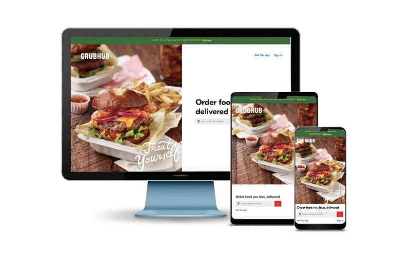
GrubHub’s overall mobile site design philosophy is simple – convince its visitors to order food and make the process as simple as possible. It makes this possible by using the phone’s GPS location to identify your location. It then prompts you to find restaurants near you.
Located below the food finder is a graphical representation of the food ordering process. The ordering process is perfectly designed for mobile devices making sure that the experience is quick and straightforward. What also makes the site great for mobile devices is its use of eye-catching graphics. With the limited screen space, it makes use of images rather than text to capture the visitor’s attention.
BuzzFeed
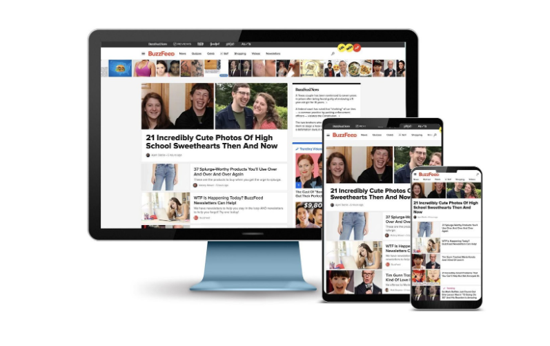
BuzzFeed has always been an excellent source for exciting content and entertainment. And it makes this content available at the palm of your hands through your mobile devices. There’s no disconnect with its desktop counterpart, all content is easily accessible giving users the same seamless experience even on the go.
Some of the noticeable differences include the use of a collage-like layout that uses images. This is used to highlight its most popular content, giving users easy access with a few taps of the finger.
BuzzFeed also makes navigating easy by offering a clickable “hamburger” menu in the top left corner of the screen. Clicking on this gives you quick access to all the different categories and content available on the site.
Etsy
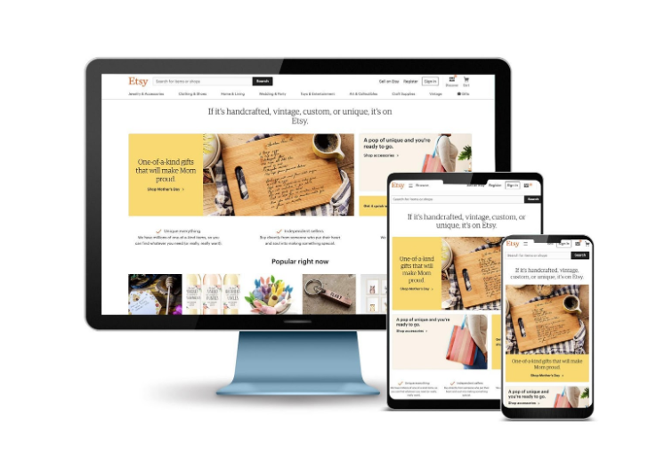
Etsy is a popular e-commerce website for a reason, it makes the shopping and buying process quick and straightforward. The mobile site has been optimized to help users quickly search for specific items or browse for items in its various categories. For such a huge website they have done a great job at making navigating the website straight forward. Not an easy task for a site this huge.
Aside from the search bar, which is prominently displayed, popular items are represented as thumbnails for easier identification. Rather than relying on text to convey content, these images make it easier for users to identify and then tap to get the corresponding information.
Oxford Dictionary

If you have ever written anything it’s likely you have come across the Oxford Dictionary. There’s no shortage of online dictionaries, but Oxford Dictionary makes an especially strong case for itself by being mobile-friendly.
Navigating the site is a breeze. The homepage is beautifully laid out and scrolling down is smooth and easy. Just tap on the menu bar to get access to the dictionary in any language you can imagine and you’re off to the races. Text size is generous on the interior pages making it very easy to read the large amounts of text required for their pages.
Zappos

Another e-commerce site that is skillfully designed to sell. Immediately at the top is the customer service link, strategically located for customer inquiries as well as a My Cart button located prominently, making it simple for shoppers to get to their cart.
If you really want to see how a product detail page should be done on mobile then navigate to a product detail page. All of the choices and menus that are required for an eCommerce product detail page have been made extremely usable on the thumb-driven phone experience.
Mile High Estate Planning
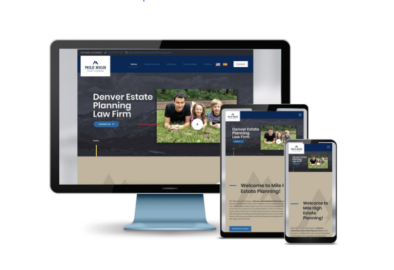
A cleanly designed mobile site that combines simplicity and functionality. You can get all the essential information by just scrolling down the site, no confusing images or banners. A drop-down menu can be easily located at the top right side of the page, giving quick access to services and contact information.
Accessing their various services can be done by clicking the corresponding icons giving it an “app” feel. No deep-drilling required, pages are just a few scrolls in size. A great example of a professionally designed mobile-first site.
Shopify
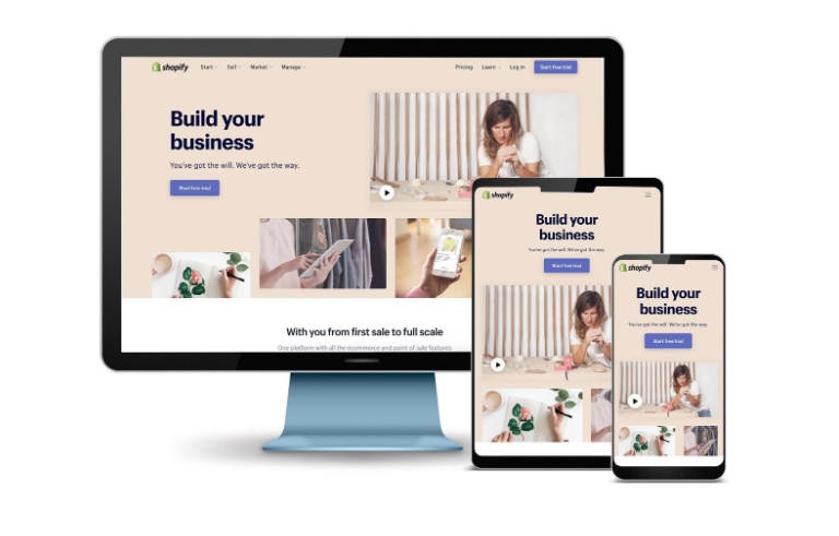
Shopify has simple messaging and clean layout on all devices. The importance of their site working well on mobile can’t be understated enough as it has to shine as an example of what their potential customer’s websites could be. It is an excellent example of a responsive site. The user experience is consistent regardless of the shape or size of the device.
Shopify seems to be hitting all the bells right, combining easy to read the text, great images, and simple navigation. It also has fast page loading speeds with highly optimized images and content.
Try out their free trial signup process on a phone and you will see that it’s just as easy as it would be if you were sitting at a laptop.
Final Thoughts
The first thing to consider when designing a mobile-friendly site is your visitor. When creating a mobile site, be sure to make it responsive, easy to navigate, use great images, and use font sizes that are easy on the eyes.
By leveraging the benefits of a well-designed mobile-friendly site, you can quickly increase site traffic and have a better chance of turning these visitors into paying customers.
About The Author
Rodney Warner heads the team at Connective Web Design and is also a musician, outdoor enthusiast, and ice cream connoisseur.

5 Tips to Improve Your Conversion Rates
6 Tips for Smarter Digital Marketing

2 Comments
Comments are closed.