In 2016, it’s almost a guarantee that a potential customer’s first interaction with your business is online. Think about it: how many people these days physically go to a restaurant to check it out before making a reservation? Almost none, right? Instead, they check out the reviews, look at the restaurant’s website, and then decide if they want to eat there.
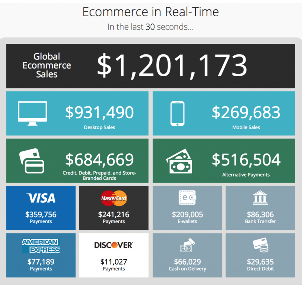
Additionally, with more businesses becoming exclusively web-based (it’s estimated that e-commerce generates almost $2.5 million every minute), it’s more important than ever to make sure your business’s website both looks and, more importantly, works extremely well in order to best position yourself to attract and retain customers. Whether you’re in e-commerce or not, you could find yourself in hot water when it comes to attracting customers if you fail to optimize your website’s landing page to retain interest. After all, how many times have you checked out a business, seen an old, outdated site, and thought about taking your money elsewhere?

With that in mind, here’s an overview of five cutting edge features your business website must include.
HTTPS
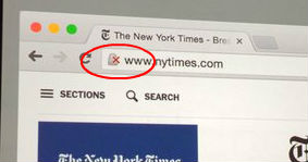
 This isn’t a particularly flashy aspect of boosting your business site, but it can still make a difference for your traffic. Once Google announced that HTTPS sites (as opposed to the less secure HTTP) will be given a rankings boost in their search results, enabling HTTPS became an absolute must for any legitimate business site. Anything to get your site higher up on Google is good for you. Switching to HTTPS will also help establish credibility, as potential customers will trust the secure connection to your site. Nothing will make a user think twice about exploring your website more than a big red x next to your URL on Google Chrome.
Video
It’s no secret that we live in an image-oriented culture. Just look at the amount of footage that’s uploaded to YouTube every minute and you’ll quickly be reminded of the fact that users love videos. Turns out, they can be great for marketing, too. Videos are a great way to “sell” your product or brand on your site, especially if you have a product you’re promoting that is tough to show off or explain. You can make your product look really good in action, and your customers will have a good idea of your products so they can immediately add them to their shopping carts. The future looks especially bright with video, as companies like LifePrint are serving up innovations to embed video within physical photos, so you’ll have plenty of ways to repurpose and share video content.
Well-Integrated Testimonials
Testimonials are, of course, good practice for any business, but especially so online. Having testimonials or endorsements can really go a long way in setting yourself and your business apart from what is admittedly a crowded market. And the nice thing about including testimonials is that they’re a flexible feature that can be added to your site in an organic way, whether that’s as a standalone page or in a video or simply a sidebar of positive reviews from satisfied customers.
Unobtrusive Email Signup Forms
Email signup forms for websites can occasionally get a bad rap these days, mainly because of the resurgence of one feature: the pop-up. Think about it. How many times during this browsing session alone will an email signup form pop up as soon as your cursor moves away from the page you’re on? The truth is, people don’t really like pop-ups (surprise, surprise), but skipping an email signup form altogether is just bad business. People subconsciously like being given a call-to-action after experiencing your site’s content, and well-placed email signup forms can be a great call-to-action that will retain customers and keep them coming back to your site. You don’t need pop-ups. You just need to put your CTAs in the right places.
Creative 404 Recovery
Ideally, your site will be easily navigable for all users, but oftentimes users still find themselves stuck in a dead-end after mistyping something in a search bar. In the event that it does happen (and it very likely will), it’s good to make sure your website’s visitors don’t get frustrated with the redirect and leave your site altogether. A good 404 landing page will point viewers back to a different page on your site (often the home page), and getting creative with 404 error messages can be a really unique way to inject your site with a touch of humor.
Main image credit: gowebbaby.com


One Comment
Comments are closed.