

Written By: Derek Randall
If you wish to generate compelling content, you must clearly communicate all your ideas so that your readers can follow them. You must stay away from bad design as that would make things really complicated and confusing. If your audience is not able to interpret the data or read your exceedingly illustrated title or get past an explosion of colors, rest assured that your visual content is sure to be a flop.
Today thanks to the exponential growth of the hi-tech mobile devices that have cameras, people are able to easily create more and more visual content. They successfully share it in a matter of a few seconds via email or text or on the social platforms. In an attempt to learn and improve together, we have identified a few flaws or mistakes usually, associated with any visual content. We would be discussing the possible solutions as well.
Some Common Flaws to Avoid
It is pretty common to make mistakes. It is, however, important to identify your flaws and make necessary amendments. Here are some of the common flaws made by marketers, designers, and brands.
1) No Call to Action
While designing any product advertisement, poster or other types of infographic, often the designer focuses his full attention on his artwork so much that he keeps on incorporating the maximum possible elements. This may be generating a truly visually attractive, information-rich image but many a time, it could be messing up with the viewer’s mind and he would be totally confused about the exact underlying message. There is no precise call to action. When in doubt, it is best to get in touch with the experts at http://www.lasvegaswebdesignco.com.
Solution
It is just not enough to talk to your audience. There should be a preferred and anticipated outcome of your attractive visual content that you are creating. Suppose it is an invite for a specific event, you must incorporate a call to action, a link or a button that could be navigated by the user for filling in more information or data and for signing up. There is no point in wasting your money and time by creating an attractive and appealing visual content that does not incorporate any clear-cut call to action. Of course, you are bound to get a few likes and shares but these would not be contributing in any way towards long-term and robust relationship building. According to experts, you must include just one single call to action that is really prominent in color, contrast, and size.
2) Lack of Strategy
Inexperienced marketers and brands often proceed without a specific strategy. You need to gain the loyalty and trust of the targeted audience and eventually, sell. Do not ignore the fact that you would be requiring a defined strategy for the success of each and every step including competitor analysis, user research and, market trends.
Solution
You must realize what your end goal is and must stick to it. You must come up with well-defined business objectives and preferred outcome. Then you must understand your target audience, their desires, dreams, and needs. Then you must determine where the two worlds meet. The meeting point or convergence should be the backbone of your strategy and that is where you would be basing all your visuals and communication on. You must consider conjoining all the data and creating a strategic backbone to support all the marketing activities.
3) Lack of Consistency
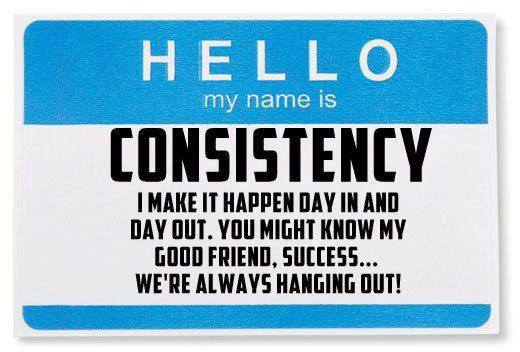
It takes a lot of dedication, hard work and time to build an image and reputation for any business. However, this reputation could be ruined in just a day. It is crucial for you to consider establishing yourself first as a brand. Gradually, everyone would begin to appreciate and recognize you; understand your business, its vision and your product. Remember any kind of inconsistency in creating your image could be hampering brand loyalty.
Solution
You should never move offbeat from color schemes, graphic style, font etc. This would be further confusing your audience. Image and content consistency would be driving more traffic and inspiring the visitors to share the content and also follow the brand.
Conclusion
In this article, we have discussed three most common flaws in visual content and how to resolve them. Hope you would now steer clear of these mistakes while building your brand. Stay alert and do not make these mistakes if you wish to take your brand to the next level.
Author Bio: Derek Randall is a web designer of repute based in Boston. He runs his own blog and is pretty passionate about blogging. He is delighted to share his knowledge and expertise with the common people around him. It gives him an immense joy to share tips, tricks, and ideas related to web design. He recommends reputed and reliable sites such as www.lasvegaswebdesignco.com for expert assistance.

6 Signs You Are a Bad Leader
How State-Sponsored Attacks Affect Businesses

One Comment
Comments are closed.