How do you make a human resources app people are willing to use? Note, I said, “willing”, not “eager”. Eager doesn’t matter, high adoption levels across and organization does.
That’s what Replicon set out to do. The company, a leader in cloud-based time tracking applications, knows a bit about usability. “We did a survey and when companies moved to on premise systems from manual systems (paper and excel),” co-CEO and co-founder of Replicon, Raj Narayanaswamy explains. “The managers [we studied] saw an improvement in time tracking process efficiency but users saw little benefit, but with cloud solutions like ours, both users
and managers saw considerable improvements.”
The key is being both easy and useful, Narayanaswamy declares. “Any excuse is a good excuse not to do timesheets, so offering multiple data entry points (web, cloud clock and of course mobile) deflates the excuse that users didn’t have access,” he continues. “Combining timesheets with project tracking expense and reimbursement tracking also makes the system sticky, as everyone wants to get paid on time and the correct amount.”
Without user-influenced design, a time tracking solution risks being too cumbersome for an organization. Replicon ensures its product evolves with user preferences by sticking with the following process flow:
- Create high fidelity, clickable prototype, field test it, iterate, pass to engineering, we use lean methodology
- Comprehensive end user Input
- Create working prototype for end users – what they wanted
In the case of Replicon’s latest product version, the company had some special help–from Facebook. Decision-makers from both companies got together, and mutually-beneficial work began. For Replicon, the process was about leveraging as much of Facebook’s UI/UX expertise as possible to give users a familiar, intuitive experience.
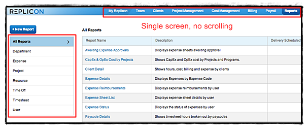
Things like a single-screen interface, tabbing and correcting order of tabs, and giving things a clean, monochromatic look to reduce distraction.
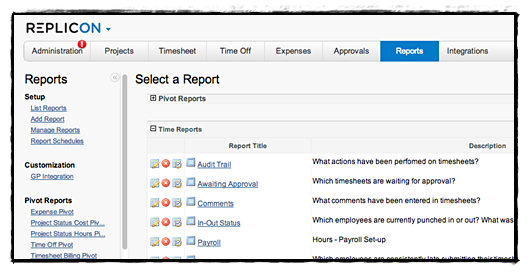
Reporting: Old

Reporting: New

“Working with Facebook was fantastic,” Narayanaswamy describes. “They were interested in our cloud-based time tracking solution, and along the way gave [us] input on user interaction and visual design of the product itself.”
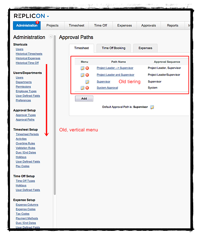
Approval Paths: Old

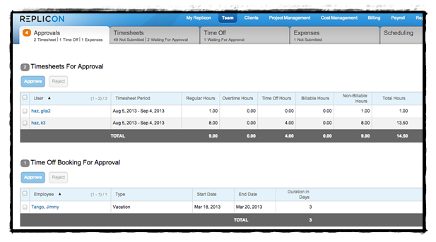
Approval Paths: New

The Results
Replicon’s latest release is an entire evolution in modern time tracking. With Facebook’s input, the product’s new and improved user interface is based around who the user is, and their role in the organization. With improved resource management and reporting capabilities, built-in compliance, deeper visibility into business performance, Replicon becomes more than an HR or accounting application.
Cloud-based, the new release also includes mobile applications for iPhone and android devices, so that time tracking entries can be made on-the-go. “Companies need true visibility into how time is used across the organization,” Narayanaswamy asserts. “We built the new release of Replicon with this in mind and to take the pain out of time and attendance.”
These changes have brought about enviable customer feedback, and exceptional user adoption marks. Replicon boast’s some of the industry’s highest user adoption and client retention.


